OPUS Demo: Working as a team to develop an eye-catching animation
Développement · 18 avr. 2023
Recently, the Home Solutions Research and Learn team had the exciting opportunity to turn ambitious dreams into reality, by adding new and mesmerizing animations onto the TELUS website.
Being new to the creation of animations when this project first kicked off the team faced a variety of different obstacles and challenges. But we were determined to adapt quickly and learn how to be successful. In the end a total of 11 new components and 7 new pages were built for the brand new Optik TV and Stream+ pages.
There were many struggles we ran into when using the GreenSock Animation Platform (GSAP), which included discovering bugs within GSAP, learning how GSAP features work, and using our logic together with GSAP. With practice and experimentation, we were able to bring these designs to life in ways we never thought were possible.
With ambitious designs, the team had to work hard to improve metrics (LCP, CLS, reduce rendering, and reduce network payload) to achieve a high Lighthouse score. Despite starting with an initial score of just 10-12, the team was able to boost their score to 60-70. This meant that the performance and accessibility of our pages were significantly improved.
As one of the first teams to use this platform we had to trailblaze through initial problems and work closely with the SiteBuilder team. The collaboration within our TELUS development community really supported us through these challenges and we wouldn’t have been successful without the monumental help from the SiteBuilder team.
Despite the many challenges, we were able to create some truly impressive pages for Optik TV and Stream+. We wanted to highlight three particular components that presented unique challenges and really pushed us as a development team.
The Animated Content Background
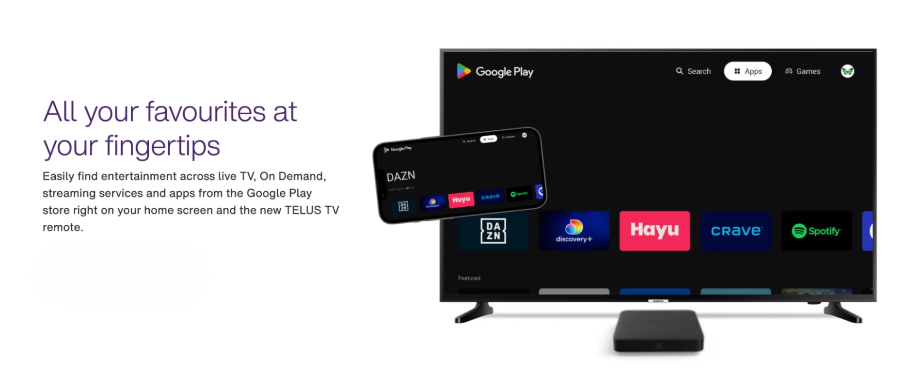
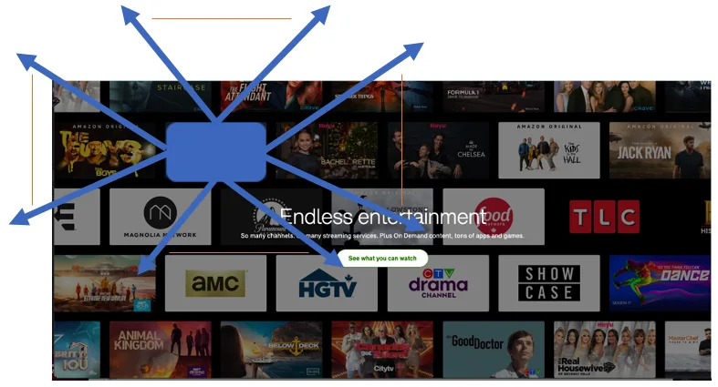
Currently, animated content background is being used on two of TELUS’ Optik TV pages. It’s being used to show different content available in our streaming and sports pages, in the what to watch section.
The requirement for this component was to have different tiles of shows or networks placed randomly along a curve around some given content, with the images following your mouse slightly when you hover over them, and appearing in a slightly different position with each render of the page.
The main component consists of the heading, subheading, image tiles, and the content to be displayed within it. There are a variety of options that can be placed inside. It can be customized not only for this use case (which is tabs showing what's available across our different platforms) but can also be used for other content in the future.
We faced many different challenges while building out this component of the site.
One challenge was learning GSAP. Although it was enjoyable to push ourselves and think differently, it was also frustrating. We were building in a new app we hadn’t used before, which consequently slowed the development process. Often when running into bugs, it wasn’t always apparent if it originated from our implementation of the animation, or something that was different within this new app.
We also had to ensure that the layout recalculated the positioning and updated correctly both when the window resized and as well as accommodating slightly different designs on mobile vs desktop.
Most notably, a major challenge was coming up with the proper solution of placing the images along the curve. Before coding we tried to come up with the best solution, and in our brainstorming session we decided on using a quadratic formula y = A(x-a)2+b. The screenshot below is from our brainstorming session.
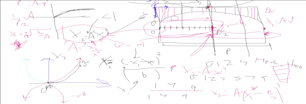
Using our quadratic formula we were able to get the values we needed to plot the images using values we knew: the width of the page (where the X coordinates are 0 on one side and the width of the page on the other); how far down the page we want the images to end (which is the Y coordinate value for our two starting X coordinates); the amplitude of our curve (A); which will give us a specific shape of our curve allowing us to avoid the images interfering with the content; and how far down we want the top center of the curve to be from the top of the page (b). With the known variables, we were able to plug them into our formula to get coordinates that allowed us to place our images.
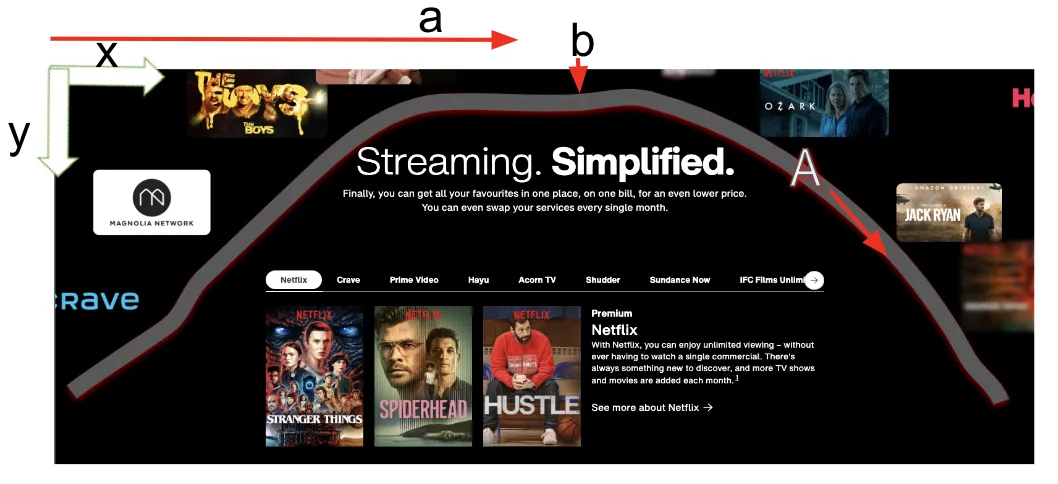
Another factor we had to consider was that the images were on the outside of the curve, as being outside of our curve boundary is how we ensured that the images wouldn’t interfere with the content. The default placement for an image is from the top left corner of an image. For all the images that were on the left side we had to account for the width of the image and shift them left by at least that amount, and for images on both sides we had to calculate the height of the image and shifted up by at least that amount as well. There were some calculations involved to determine whether the image was on the left or right to ensure we were adjusting its position appropriately. We spread the images out equally along the curve, dividing the width of the component by the number of tiles. From there, we slightly shift each image by a random value, creating a different look each time the page loads.
The Staggered Content
Staggered Content is the most widely used component in the Optik TV live pages. It appears on all 7 of the pages and includes 17 independent use cases with different designs and animations on those pages.
Staggered Content allows for many different types of layouts. For each layout there are a wide variety of animations that our content managers can pick and choose from. These animations make important details pop and provide the customers with live interactions as they scroll.
Currently, the types of animations available include:
Content sliding in from the left, right, or bottom of the page
Fading in the text or the image (or both)
An animation that moves an image from the center of the screen to the side which reveals new text under it
A scale and pop animation
And an animation that slides a different coloured background behind the content
The Optik TV and Stream+ pages included a variety of different designs that all shared a handful of similarities. To avoid creating multiple components to be used for the same purpose, we worked on making the staggered content component extra flexible. Due to the high number of designs this component needed to fulfill, the biggest challenge was making it a one size fits all solution.
With all of the extra flexibility we were also faced with another problem. We exceeded the maximum number of customizable fields our content managers had access to in our Content Management System (Contentful).
This was a major problem for two reasons.
First, without all of the customizable fields we had planned being available, the Content Managers would be unable to replicate every design that was asked for. Second, there would be no room for any future additions to make this component work for new designs and pages.
We solved these issues by developing innovative solutions that reduced the need for many customizable fields. This resulted in reducing the number of fields by half, simplifying the creation of the entry, and making it reusable in the future. We are excited to have this component included in many other pages in the future. The flexibility of the design and animation really allow for it to be used in any page template.
The Animated Title Trailer
The Animated Title Trailer component is the first thing the viewer sees when visiting the brand new TELUS Optik TV landing page.
It consists of three subcomponents:
Main Trailer
Center Image Tiles
Framed TV (with trailer)
We worked through a variety of different stages that each had a learning curve and different outcome for the customer. There were many challenges regarding this component, and here are a few that we want to outline:
Uncertainty - There are a large number of animations, which led to uncertainty on how the animations were supposed to play. We demoed our progress weekly to ensure that we captured all the requirements. Iterative feedback was key to our success.
Performance - When this component was initially developed our team was new to using GSAP. Consequently an event listener was attached to each image in this component, which resulted in load times of > 7s. It was later discovered that only a single listener is needed. We also had to find solutions to limit the amount of times that subcomponents render, and also did many small adjustments which included swapping out images and videos in favor of webp and webm formats.
Bugs - Many bugs were caused by edge cases that were tricky to discover. One example was visual glitches with certain physical phones which did not occur when using a simulator. The visuals were sometimes slightly different when using various browsers and we had to make sure that our code handled those cases. A lot of funky things were happening when resizing the page related to GSAP and we had to think of ways to get around this.
Logic - A lot of logic went into this, especially revolving around the Center Image Tiles. The most difficult technical challenge regarding this component was to find a way to distribute a dynamic amount of images around center text but also ensure that the images are always in randomized locations and not cluttered.
We spent a significant amount of time deciding how the images should be laid out and how they were distributed around the center text. It was apparent to us that the image grid is symmetrical and that our content managers should be able to add images starting from the middle of the page, expanding outwards to the edges of the viewport. We therefore moved our coordinate system horizontally to the center of the Center Image Tiles subcomponent to simplify our calculations.
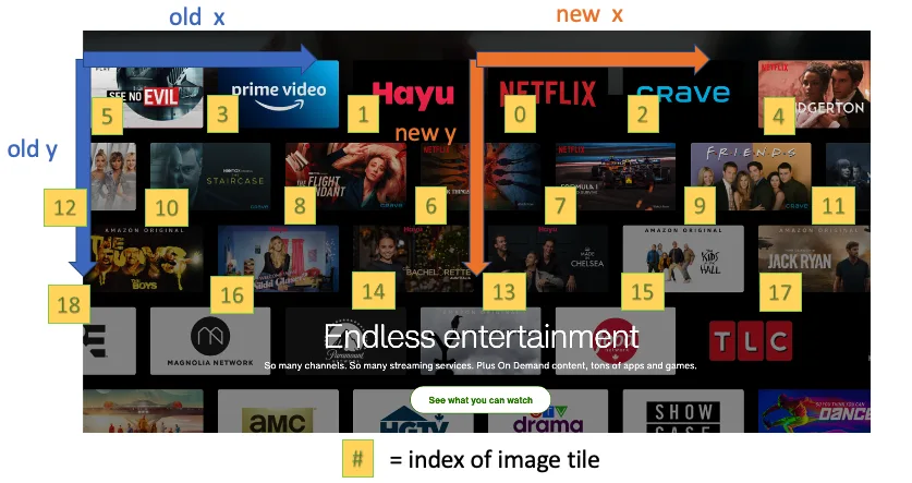
The images scale to the width of the page and will always have up to 6 tiles on the first row, and then 7 on the second row and vice versa in desktop mode. On mobile, it alternates between 2 and 3 tiles. Once the tiles were laid out there were several next steps to distribute the images to their final destination.
Perform calculations with global coordinates
When using GSAP and moving images around the screen, a local coordinate system is attached to each image. This makes it difficult and confusing to perform calculations relative to the global coordinate system. As a result, we found out how many pixels it takes to move each image into the corners of the viewport in order to eliminate working with local coordinates. Looking back, finding a single point where each image tile overlaps is enough; however, we decided to store 3 more locations that could be accessed.
Identify image tile distribution areas
We identified 4 main areas that image tiles need to animate to: left , right, top and bottom of the screen. In order to ensure that the images are distributed vertically each section was further subdivided.
Determine the amount of images to animate within the viewport
As mentioned earlier not all images are supposed to animate within the viewport; consequently we needed to create a formula for this. We took the viewport width of the four main areas and found out how many layered image tiles (before being scaled) could fit horizontally within each section. To give our content managers control to change the image tile density, we introduced a variable that can be adjusted in our headless CMS. We also had to factor in that there will be differing amounts of spacing around the center text with different viewport sizes in our formula.
Animating tiles outside of the viewport
Choosing a single edge for the images to animate outside of the viewport seemed a bit too robotic and did not meet our original designers intentions to create a ‘cloud effect’ around the center text. As a solution, each image that animates outside of the viewport randomly chooses an edge to exit from. The other axis will then be given a range that it can move as the tile moves off the screen.
We are so proud of our team and making this project a reality! We learned lots along the way and will continue to push for even more ambitious projects in the future.
Authored by Home Solutions Research and Learn developers
Natasha Colusso, Ryan Doubinin, Aaron Kao, Sandy Tian